This is a new series I’m debuting today. Here I’m going to take someones Real Estate website and critique it. I’ll highlight both the good and the bad. I’d like to thank everyone who submitted their websites to be reviewed and they will be going forward.
The first look behind the curtain is of StuartSinclair.com. The Stuart Sinclair Team is with RE/MAX West Realty Inc., Brokerage, out of their office in Bolton, Ontario.
So let’s start with their home page. When you go to the website you see this:
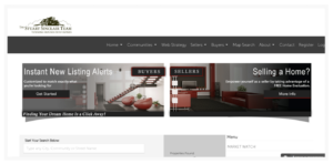
Visually, it works, it’s clean and not overly cluttered. It’s pretty quick to be able to see what your options are and no cheap sales gimmicks on the page. Another great feature that they have here is the chat function you can see at the bottom right corner. Website visitors are able to instantly connect with them when they are online. How often they are online I’m not sure but it is a great option to have. If you want to add chat to your website you can use Zopim. I would guess they do have a fairly good conversion rate compared to the industry average on this page.
There are definitely some improvements that can be made to this site though. For instance, you have to scroll down to see their contact information. You always want to make it as easy as possible for someone to contact you so I’d move the contact information opposite the logo at the top of the page on the right hand side. If you’re willing to have the cell phone displayed (assuming the number listed as Direct is a cell) I’d also say “Call or Text” because many consumers today are more comfortable texting. The email in the contact information is a clickable link but doesn’t look like a clickable link so the colour should be changed slightly from the other font colours so that its obvious to the average visitor that it can be clicked on.
Below their contact information is the link to their social media. The first thing to take note of is the fact the when you click on the Facebook link its actually a dead link. It takes you to a error page on Facebook. You always want to go through the links on your website from time to time and make sure they are still active and working. I did let them know about this so hopefully by the time you’re reading this its been fixed!
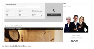
When you scroll past the fold you also see a video. Great use of video, its well produced and video does great on websites. The only improvement I’d make here is to add the videos into a playlist on YouTube so that when one video finishes it starts another one. Right now when it ends you get a list of other videos that YouTube may think you like and its possible that your competitors listings show up. When you embed the playlist it will just play your next video. Keeping the attention on your business and not someone else.
Since the Stuart Sinclair team is using video they should also be highlighting it more. It’s a huge competitive advantage. One of the tabs across the top should say something along the lines of “Video Channel” or similar.
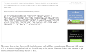
When you look at the tabs you can see that Web Strategy is one (picture below). When you click on it there is a lot of great information for the consumer but its not SEO friendly. What’s been uploaded is a .jpg file with the text embedded in the file. Google and its “spiders” aren’t going to read that and index it for search engines. Anytime you are uploading information its better to upload it as text and then just include images alongside the text. This will help you rank better in the search engines. Right idea with this tab but be mindful of how Google searches it when uploading content.

I won’t go through every single tab for this post but lets take a look at a few more to highlight what’s being done well and how it can be improved. For instance, look at the Sellers tab, and go to the first option “Sellers Value”. This page is better optimized for Google in the sense that it can be read by the Google spiders but I’m willing to bet without asking them that they aren’t getting many leads from this page in particular. At the bottom of the page instead of telling people what questions you want them to answer, have a contact form where they can ask those questions directly on the site easily.
One of the other tabs on the website is for First Time Buyers. Great idea to target specific groups as that can lead to higher conversion rates when targeting more specific groups. However, whats here is just an explanation of how they can be helped in person. You may find more success with generating leads if you offer them something of value in exchange for their contact information such as a First Time Home Buyers Guide.
Under the about tab they also have a Testimonials page. Love the page itself, it is filled with video testimonials which is 100% the best way to do it. The only thing I may do differently is to remove it as a sub-tab and make it one of the main ones on the site to highlight it and drive more traffic to it.
Lastly, the contact page is good but the contact form isn’t well defined. right now. As you can see its hard to tell where exactly to input the information. Some clearly defined boxes may boost the conversion rate. The easier you make it for visitors on a site the more likely they are to convert. 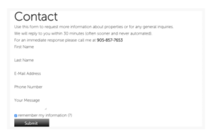
Those are my thoughts on the StuartSinclair.com website. It is a good overall website and does generate some leads but there is a lot of room for improvement however. Most of the changes are relatively easy to do and would just take a little time. They are on the right track!
If you’d like your website profiled in a future edition of Behind the Curtain please leave your website URL in the comments below.


0 Comments