Today we are taking a look at JamesPallister.ca. Thank you to James Pallister of RE/MAX West Realty Inc., for submitting his website to be reviewed as part of the Behind the Curtain series.
James has something in common with me from my time selling real estate. We both used Wix to build our own website. Wix is a DIY platform that makes website building easy. There are a lot of options like that out there, for example this website you’re reading this blog on was built on SquareSpace.
So let’s take a look at JamesPallister.ca
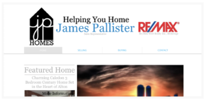
As I’ve mentioned in a few past posts in the Behind the Curtain Series, the contact info should be at the top of the screen when people come to your page. You want to make it as easy as possible for people to contact you.
When someone visits your website you want to be able to include a call to action above the fold and this is where you can see some weakness in this site right off the bat. The banner is very large, taking up a large portion of the screen. When you get here the closest thing you see to a call to action is “more information” under the part about the Featured Home.
Now what happens when you actually click on the call to action? It opens up your default mail program on your computer or device and prompts you to email James. I’m willing to go out on a limb and say that this generates little to no leads. On my original site I tried something similar. “Click Here to Email me for more information” because early on I didn’t know how to embed contact forms. I got precisely zero leads. Then I learned how to embed contact forms using 123ContactForms and within 24 hours of making the switch from click to email to contact forms I started getting leads.
Back to the featured listing, when they click on it, I’d have them go to a page where you feature the listing. People are used to just seeing the information that is provided on Realtor.ca. If they come to your website they are expecting to find something different. So give them more. Write a long blog post about the property giving them more information than they can find anywhere else. Then you’ll start seeing your bounce rate lower and that you have more returning visitors because they are having something of value come out of showing up to your website.
The main page definitely could use a redesign to create a better call to action and declutter a bit. As well, I’d personally remove the Google+ link. It’s a dying platform and nothing has been posted on that account in a long time so no point in promoting something you aren’t using.
The blog is also a great idea. I’m a big proponent of blogging. However I would keep the blog on the website and not have it go to a different website. You can blog through the Wix platform and I’d recommend doing that. The content in the blog is also a little confusing. Scrolling to the bottom quickly it appears all but one post is about wine and then one random article about understanding credit reports. Keep a blog consistent and on a particular theme to actually see results. Wine and Credit Reports are very different topics and generally shouldn’t be in the same blog.
I like the idea behind the About Page. Clearly showing who you are more than just someone who happens to sell Real Estate. This is a great way to build rapport. Although you may want to link the word geocaching to an explanation of what it is since most people have no clue. Basically goes for anything on your website that isn’t in peoples everyday lexicon. Link to an explanation of what it is.
The Seller and Buyer both have similar issues. Its good that they are concise and to the point but no call to action really stands out on the pages. I’d replace the link to the contact page with an actual contact form itself. I’d also offer some sort of resource on those pages for buyers and sellers to help them. Since you don’t have IDX/DDF on your site you should offer them another reason to come back. So provide them with something valuable that will help them in their journey; not just a simple description of some of the things you do.
It’s good that you have testimonials as well. I’d move that up to the main tabs as opposed to a sub page under contact so its more prominent. You may also want to include some visuals to make it easier to digest for the reader.
Overall the website does have some nice pictures on it and is clean which is good. I think the general layout and call to actions need to improve and some contact forms would go a long way to generating some leads. With that though now you need a reason for people to come to the site. So provide them with something of value that will help them in their journey of buying and selling homes.
If you’d like your website featured in a future post in this series let me know in the comments below!


0 Comments